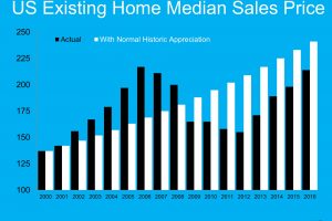
The Black graph lines is what actually happened in the years noted at the bottom of the graph. The White graph lines is what would have happened if we had normal appreciation from the year 2000 through this year (2016). Although we are growing toward the graph lines meeting, we still aren't there yet, nationwide. In Georgia we actually may be over that line. If you want to know what the graph would look like in your neighborhood or general area, all you have to do is ask and we are happy to … [Read more...]
Northwest Atlanta Properties
Home Sales & Property Management Services
Professional real estate services for Sellers, buyers, owners & tenants. Specializing in the Northwest Atlanta communities of Roswell, Marietta, Alpharetta, Milton, Woodstock, Kennesaw, and the Surrounding Areas.
Contact Us
We look forward to hearing from you!
Office: (770) 726-1454
info@nwatlp.com
3380 Trickum Rd Bldg #1300 Suite 100 Woodstock, GA 30188
Be sure to follow us!
