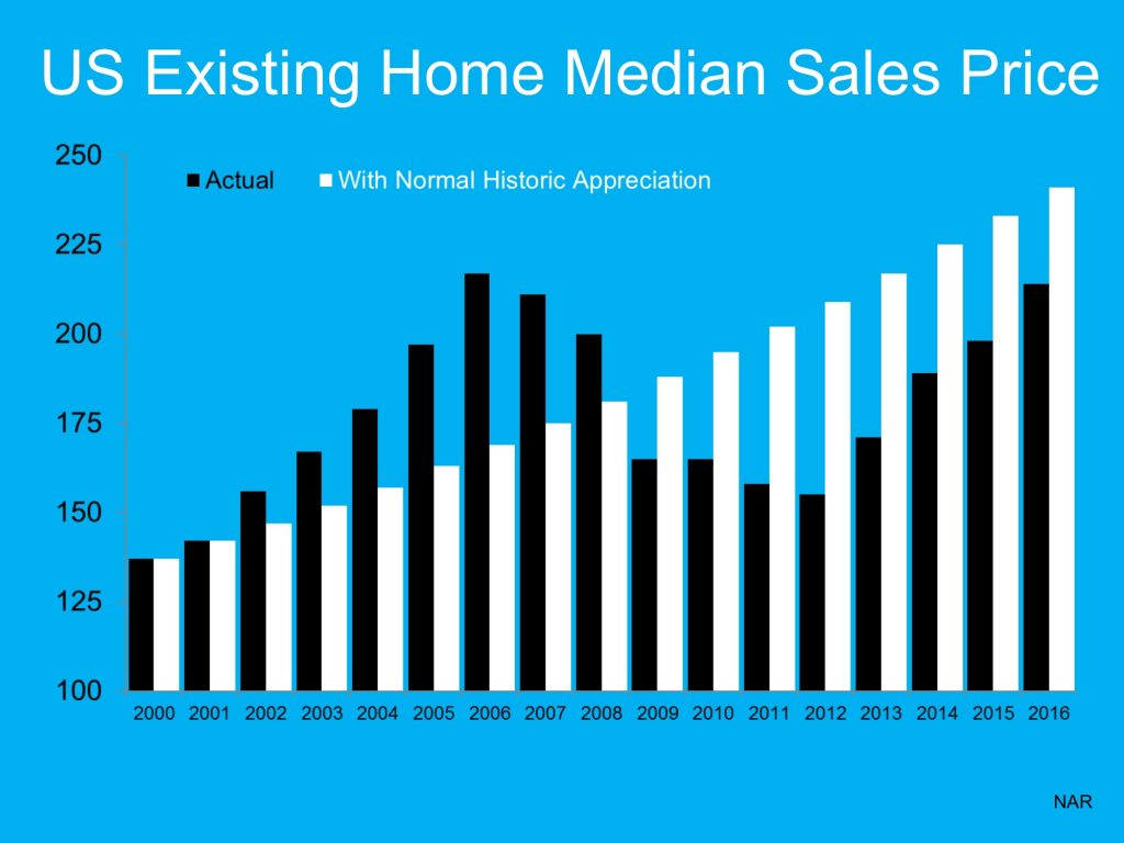
The Black graph lines is what actually happened in the years noted at the bottom of the graph. The White graph lines is what would have happened if we had normal appreciation from the year 2000 through this year (2016).
Although we are growing toward the graph lines meeting, we still aren’t there yet, nationwide. In Georgia we actually may be over that line. If you want to know what the graph would look like in your neighborhood or general area, all you have to do is ask and we are happy to help!
This national graph from the National Association of Realtors shows clearly that we have room to grow before we catch up with a “normal appreciation” line.
