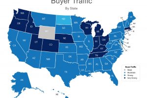
Buyer Traffic Graph in the last quarter (to mid year 2016). Yes... Existing home sales shot up in 2003-2005. But, if we look at where they were from 1990 to 2001 and where they are now, we’re in a natural course based on population increases and people still wanting the American Dream. New existing inventory just the last twelve months has fallen off because people are starting to buy new homes rather than existing home inventory. Let’s take a look at buyer demand across the whole country … [Read more...]
Housing Affordability
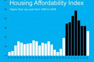
Housing affordability index published by the National Association of Realtors. Yeah. It’s not as good as it had been when we had all those foreclosures and short sales out there and prices were driven down. But, today’s affordability index is still higher, and, again, the higher the better, than is had been for the twenty years prior to that. We are quickly catching up to what is considered normal. Today’s affordability index is still higher, and, again, the higher the better, than … [Read more...]
Home Median Sales Price Data
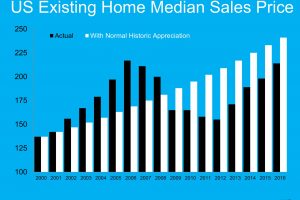
The Black graph lines is what actually happened in the years noted at the bottom of the graph. The White graph lines is what would have happened if we had normal appreciation from the year 2000 through this year (2016). Although we are growing toward the graph lines meeting, we still aren't there yet, nationwide. In Georgia we actually may be over that line. If you want to know what the graph would look like in your neighborhood or general area, all you have to do is ask and we are happy to … [Read more...]
- « Previous Page
- 1
- …
- 205
- 206
- 207
- 208
- 209
- …
- 222
- Next Page »


