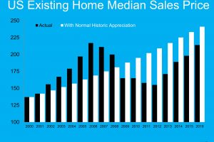
The Black graph lines is what actually happened in the years noted at the bottom of the graph. The White graph lines is what would have happened if we had normal appreciation from the year 2000 through this year (2016). Although we are growing toward the graph lines meeting, we still aren't there yet, nationwide. In Georgia we actually may be over that line. If you want to know what the graph would look like in your neighborhood or general area, all you have to do is ask and we are happy to … [Read more...]
Look at Buyer Traffic!
Another recent study put out by the MacArthur Foundation showed that people’s belief and the fact that buying a home is an excellent long-term investment, because it’s likely to increase in value over time and is one of the best ways for people to build wealth and assets. And look at what happened to Buyer Traffic as a result! Call us to help YOU … [Read more...]
Developing Housing Shortage – Look at DOM!!
GA homes are in demand. We are seeing low housing inventory and higher prices for homes NOW! Homes selling for 5.9% higher than last year. Also homes are selling fast - average days on market 30-45 DOM. … [Read more...]
Mortgage Rates & Aver days to close a Loan – Graphs
Five Reasons to Buy
- « Previous Page
- 1
- …
- 106
- 107
- 108
- 109
- 110
- …
- 116
- Next Page »

